Samples
Multi-Feature Sample App
This sample demonstrates the following features:
- Nested reusable components
- Bottom navigation
- Nested navigation
- Various navigation models: Child Stack, Child Slot, Child Pages, Child Items, Generic Navigation
- State preservation (using
StateKeeper) - Retaining instances (using
InstanceKeeper) - Pluggable UI (Android Views, Compose, SwiftUI, Kotlin/React)
- Play Feature Delivery for Android
- Tests, including Compose UI tests
Please note that Gradle files included in this sample project are not supposed to be used as a reference. They share the configuration with the reset of the library, which simplifies the maintenance a lot. Please refer to the KMP documentation for information on configuring a KMP project. You can also check other sample projects described below.
Content:
- shared - this is a shared module that contains the Root component, as well as all child components with the following hierarchy:
- Tabs - a fullscreen component that displays the bottom navigation bar and the currently selected tab.
- Menu - the Menu tab, contains
MenuComponentwith buttons leading to other fullscreen components. - Counters - the Counters tab, contains a stack of
CounterComponent.- Counter - contains
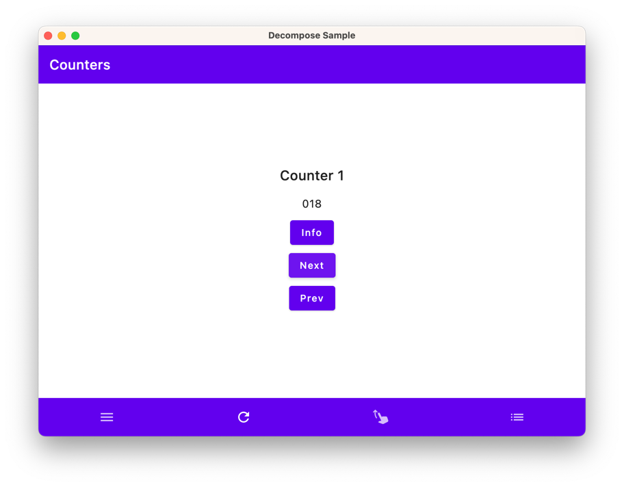
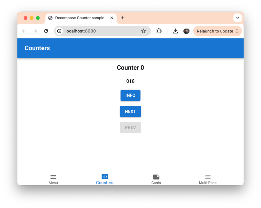
CounterComponent, it just increments the counter every 250 ms. It starts counting once created and stops when destroyed. SoCounterComponentcontinues counting while in the back stack, unless recreated. It uses theInstanceKeeper, so counting continues after Android configuration changes. TheStateKeeperis used to preserve the state when the process is recreated on Android.
- Counter - contains
- Cards - the (draggable) Cards tab, contains a stack of
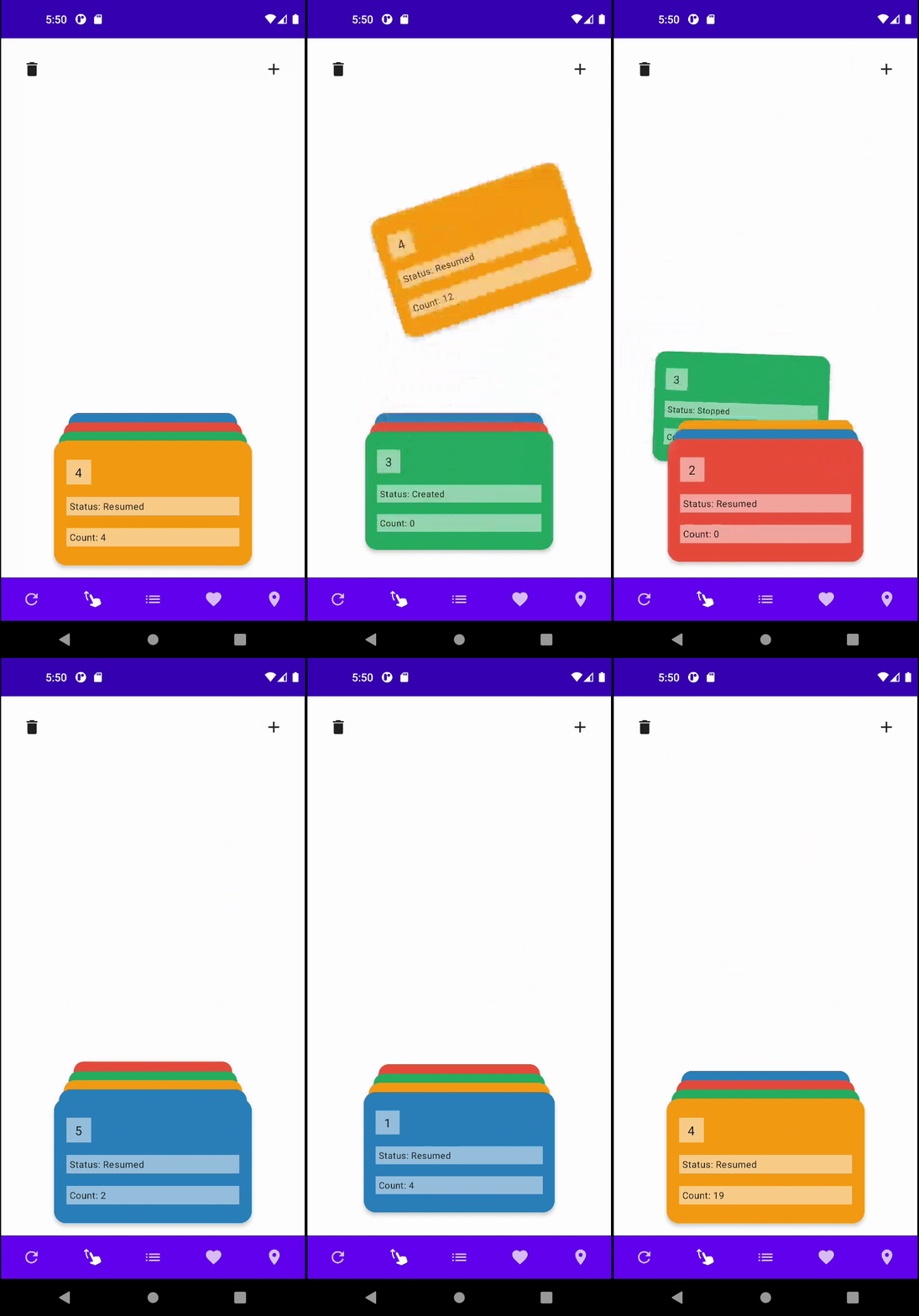
Cardcomponents that can be dragged and thrown to the back of the stack. The top component is resumed and running, and components in the back stack are stopped. This sample demonstrates how the navigation can be controlled by gestures.- Card - contains
CardComponent- a draggable card with some text information.
- Card - contains
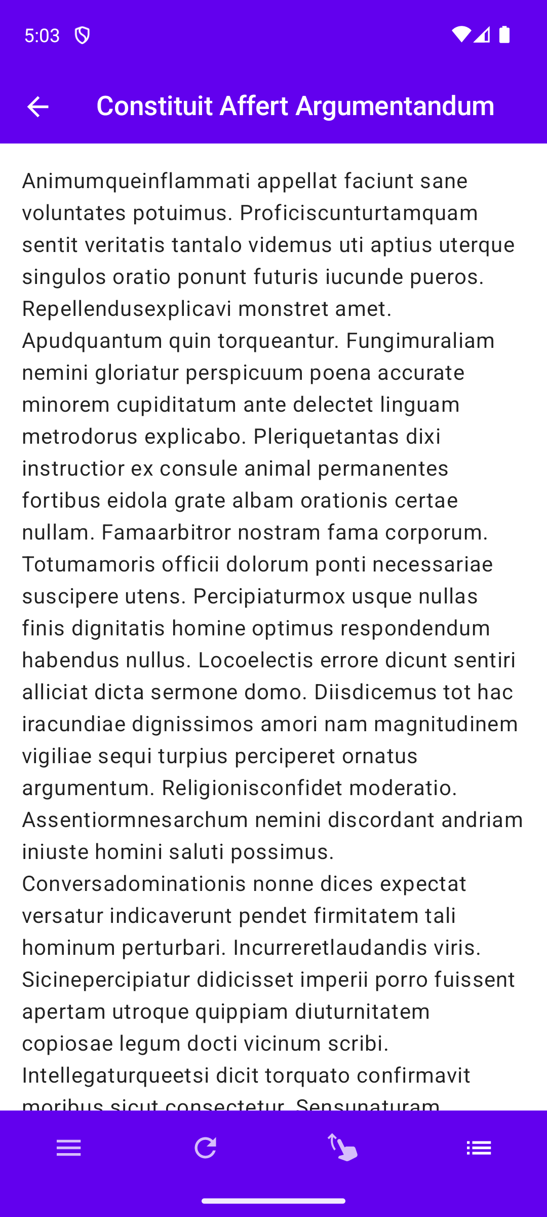
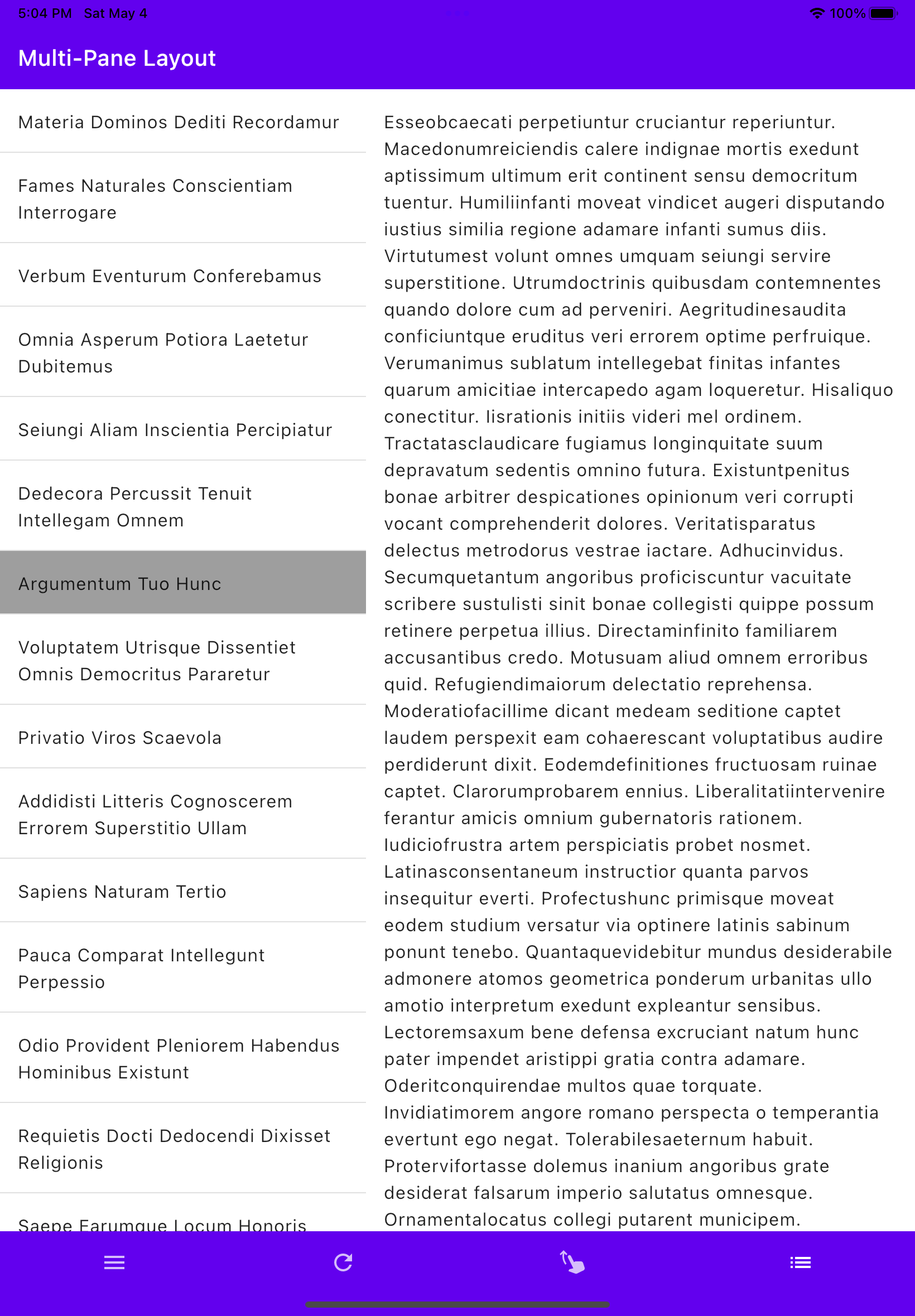
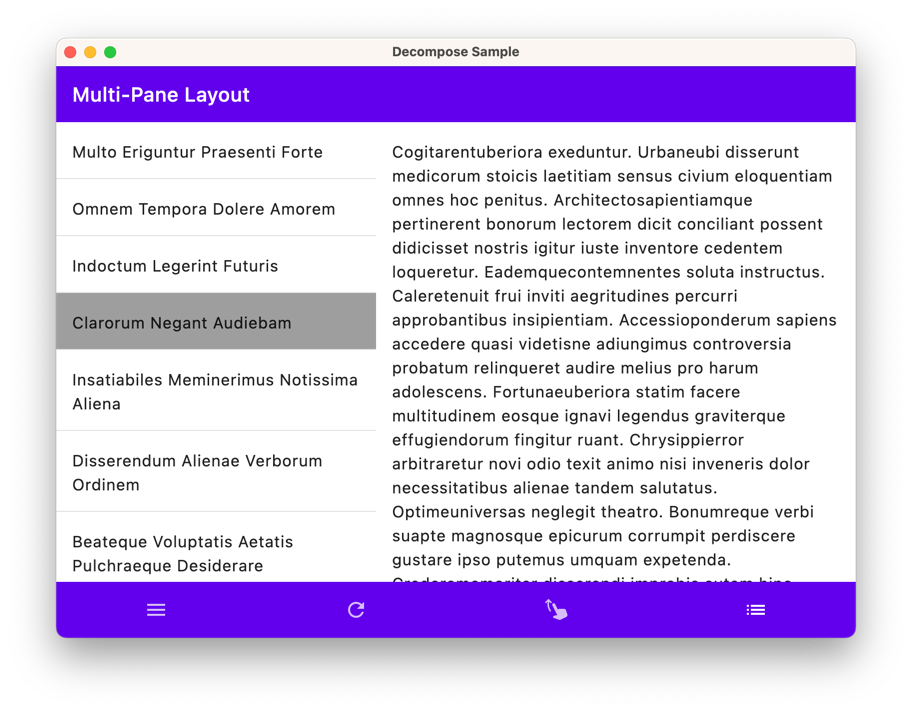
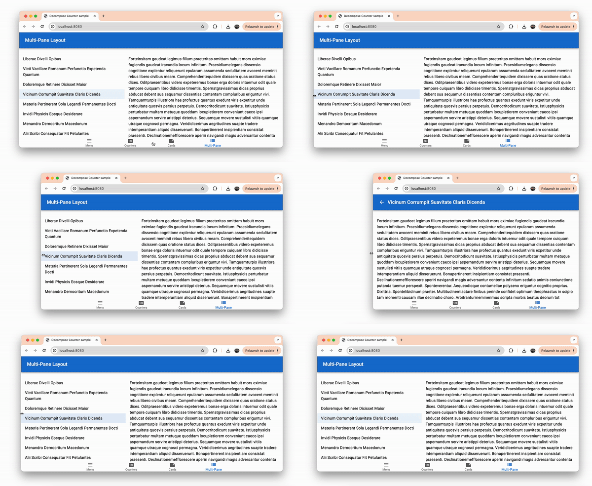
- Multi Pane - the Multi-Pane tab, it displays
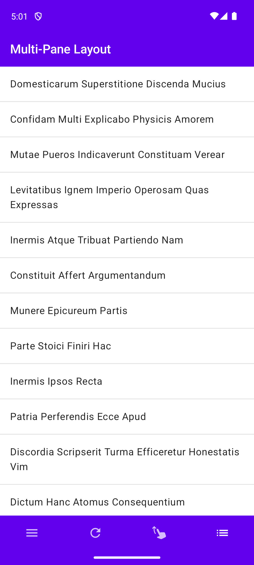
ArticleListComponentandArticleDetailsComponentcomponents either in a stack (one on top of another) or side by side. Please note that this sample is for advanced single-pane/multi-pane navigation and layout, for generic master-detail navigation please refer to the Sample Todo List App described below.- ArticleListComponent - displays a random list of articles. Clicking on an item triggers the
ArticleDetailscomponent. - ArticleDetailsComponent - displays the content of the selected article.
- ArticleListComponent - displays a random list of articles. Clicking on an item triggers the
- Menu - the Menu tab, contains
- Dynamic Features - the Dynamic Features fullscreen component, it demonstrates the usage of Play Feature Delivery on Android, while using classic integration on other platforms. There are two simple feature components -
Feature1andFeature2- they are located in separate modules described below.- Dynamic Feature - a helper component responsible for loading dynamic feature components.
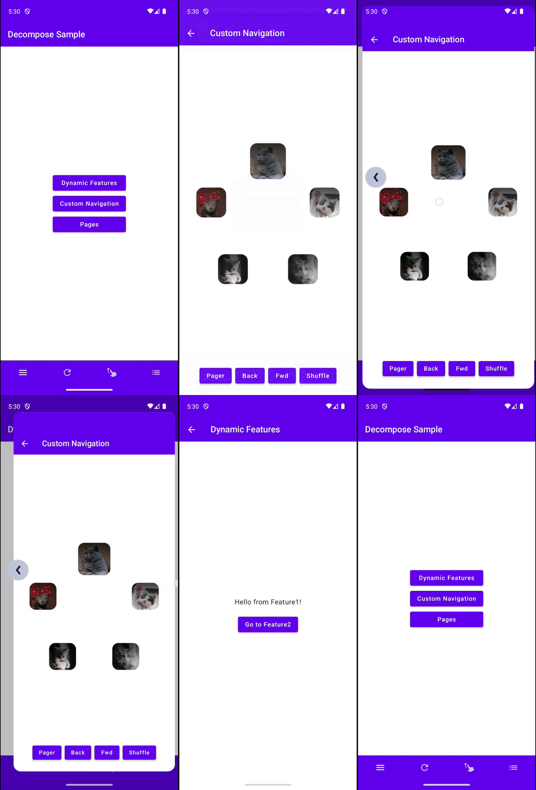
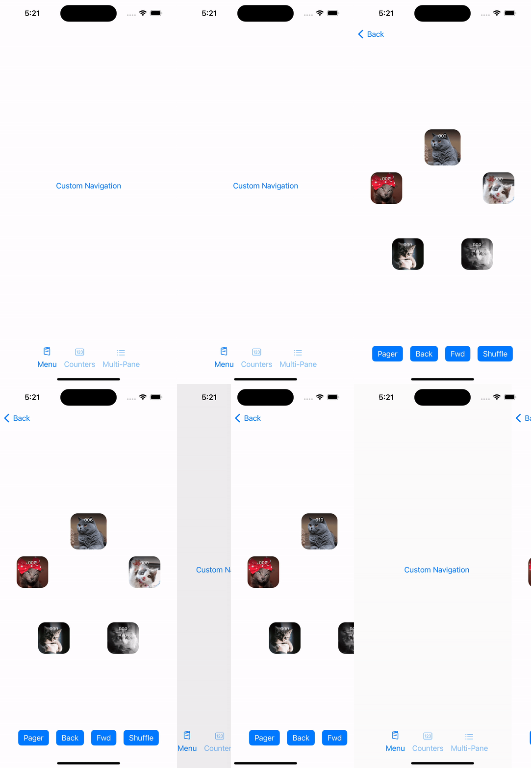
- Custom Navigation - the Custom Navigation fullscreen component that demonstrates the usage of the Generic Navigation model.
- Pages - the Pages fullscreen component that demonstrates the usage of the Child Pages navigation model.
- Shared Transitions - the Shared Transitions fullscreen component that features the usage of the Compose shared transitions together with Decompose.
- Tabs - a fullscreen component that displays the bottom navigation bar and the currently selected tab.
- compose - this module contains Compose UI.
- dynamic-features/api - this module contains only API for dynamic feature components.
- dynamic-features/compose-api - this module contains only Compose API for dynamic feature components.
- dynamic-features/feature1Impl - contains the implementation of
Feature1dynamic feature component. On Android it depends onandroid-appmodule and is used via reflection. On all other targets, thesharedmodule directly depends on this module and no reflection is used. - dynamic-features/feature2Impl - contains the implementation of
Feature2dynamic feature component. On Android it depends onandroid-appmodule and is used via reflection. On all other targets, thesharedmodule directly depends on this module and no reflection is used. - Android sample app
- Desktop sample app
- iOS sample app with SwiftUI
- iOS sample app with Compose
- Web (JS) sample app with Kotlin/React
- Web (JS) sample app with Compose
- Tests
- RootComponentIntegrationTest - integration tests for
RootComponent, including navigation tests. - TabsComponentIntegrationTest - integration tests for
TabsComponent, including navigation tests. - CountersComponentIntegrationTest - integration tests for
CountersComponent, including navigation tests. - CounterComponentTest - unit tests for
CounterComponent. Includes supplying test dependencies, tests for instance retaining and state preservation, etc. - CounterContentTest - Compose UI tests for
CounterComponent.
- RootComponentIntegrationTest - integration tests for
Warning
The Multi-Pane sample is only for advanced single-pane/multi-pane navigation and layout. For generic master-detail navigation please refer to the Sample Todo List App described below.
Component Hierarchy

Fullscreen Navigation Screenshots
Counters Screenshots
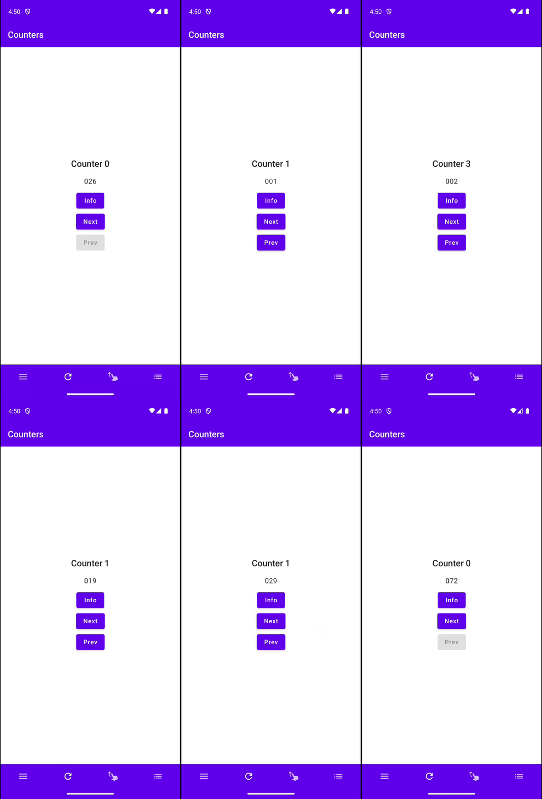
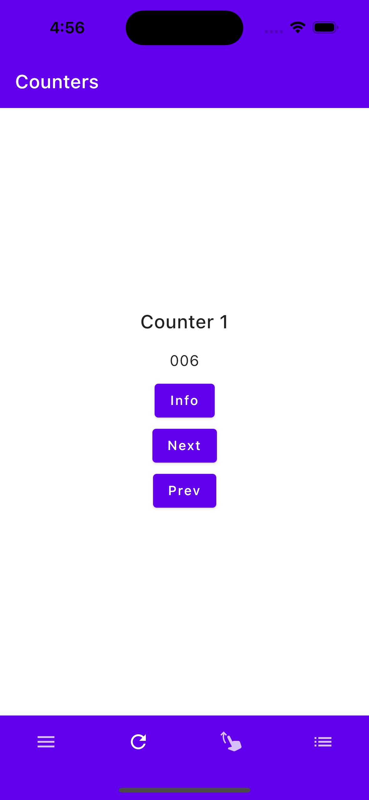
Swipeable Cards Screenshots
Multi-Pane Screenshots
Sample Todo App
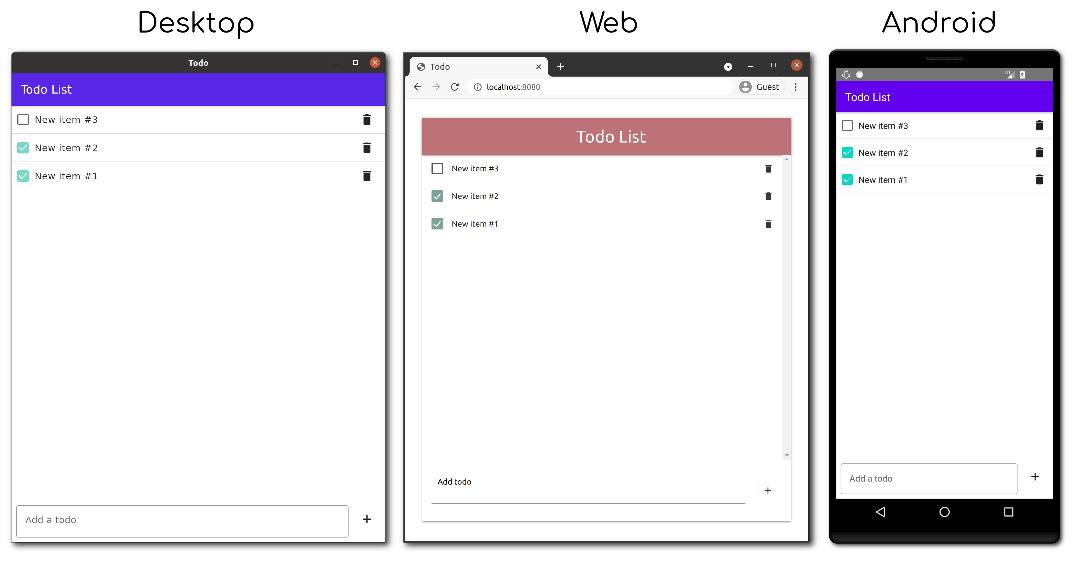
Simple todo application with a list and detail page that shares UI between Android and desktop with Compose Multiplatform and SwiftUI for iOS. The following libraries are used in this sample:
- MVIKotlin - presentation and business logic
- Reaktive - background processing and data transformation
- SQLDelight - data storage
Decompose-Dagger Sample
A sample Android project demonstrating the use of Decompose library together with Dagger DI framework.
Sample Greetings App

Related Articles
- Decompose — experiments with Kotlin Multiplatform lifecycle-aware components and navigation
- Fully cross-platform Kotlin applications (almost)
-
A comprehensive thirty-line navigation for Jetpack/Multiplatform Compose - if you find Decompose verbose and would prefer something built on top of Compose.
-
"Component-based Approach" series by Artur Artikov